1. In what way does your media product use, develop or challenge forms and conventions of real media products?
From reviewing my research on codes and conventions of music videos, I believe my media product uses them effectively. Looking at the conventions of a music video, I have noticed that I have used them and developed to fit with my own ideas.
I have a performer performing the song and I have interpreted this into the narrative. The song lyrics influence what is shown in my video, examples of this are with the "river running free" the artist is singing with a water effect over the top. The link between the lyrics and what is being shown is seamlessly put into the video to make sense to the viewer.
The codes of dress reflect the mood and tone of the song, he wears a suit because he looks and feels good this links with the theme of the song.
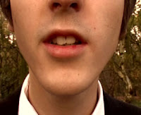 I have also shown that I have used the technical codes and conventions of a music video through the camera shots, especially with the CU of the performers face and the ECU shot of the singers lips at the beginning, however it does develop the conventions when I used ECU of inanimate objects.
 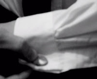 My product contains vertical tilts which are conventional to a music video; however there is no tracking or crane shot as I have limited resources in comparison to the media industry.
 Looking at the editing, I have used and developed the codes and conventions, by using jump cuts; to make the audience feel as though they are jumping from location to location. The pace of my editing matches the rhythm and pace of the song. I created a few series of split screens within my video; this made it visually more interesting and is also another technical code of a music video.
 Other digital effects, was the use of colourisation, I developed this effect throughout my video, by making scenes brighter and enhancing the colours and by completely manipulating the shots through a bright colour filter.
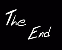
My personal favourite digital effect was the ending, and how I developed the use of a narrative within a music video and by giving it a movie feel by making “the end” handwritten.
 I have used expressive lighting to make the artist appear ageless, which a technical convention of a music video. I also switch from black and white to colour this shows switching from location to location and from chorus to verse which is another code and convention.
 The misé en scene is for it to have a concept. I have developed my concept and gave it a love, romance theme this is what my research questionnaire suggested.
The print artefacts I had to create involved: an album cover and an advertisement poster.
My album cover uses the codes and conventions of an industry made product; it contains the artist's name, album name, track listings, label name and information, barcode. However, I have challenged the conventions by using a dark background, instead of the typically white background you would see on industry made Michael Bublé album. Although, the way in which I executed the dark colour still made it feel bright and you could still feel the genre of the music through the album artwork. I also adapted the title of the album, "It's Time", into my artwork by using a theme of clocks in the background. Within his original album artwork I have noticed that the album is focused just on Michael Bublé, I have developed this with the swirl/clock pattern to highlight the artist along with the background to give just an image of the artist a classy and professional look. I also have the artist in his suit, the same one which he wore in the music video. Not only does this link with my main product it uses the convention that Michael Bublé appears to be always pictured in a suit on his album covers.
The advertisement poster fits the conventions of an original HMV poster. It includes; black and white image, logo, slogan, “my inspiration”, album artwork and lyrics. I haven’t developed or challenged these due to wanting it to look industry made.
[See previous posts about artefacts, to illustrate]
2. How effective is the combination of your main product and ancillary texts?
I think there needs to be an effective combination between the main product and the ancillary texts; however, I don't think there needs to be a strong link because in reality the album has more than the one song which I used for my music video. The album would contain lots of other songs with videos. This said I didn't want my album cover to look too specific to the music video I created. The advertisement poster used pre exiting codes and conventions from the HMV 'Inspiration' adverts, I feel the link between the one I created and pre-existing ones I found in my research is strongly linked.
Combinations I made were that I used the same artist throughout by using the same person this kept with the continuity and avoids any confusion. Within the music video I created, I made the classic black suit an iconic outfit as to show he was not only looking good in his suit but also making him feel good. So when it came to creating my album cover I organised a separate photo-shoot with the artist taking various images of him in the same suit. This aided to the overall product giving it a sophisticated and professional look. By taking separate pictures, it helped me when it came to the editing and creating part because I had lots of different pictures to choose and work with, not only that but it also gave me better quality images. The reason I didn't use a freeze frame from my original video was because of the picture quality it produced, I felt by using a freeze frame it wouldn't enhance my album cover but give it an amateur look which I didn't want.
When creating the poster, I noticed from other pre-made products that the artist(s) were in a casual setting, wearing casual clothes. So within the photo shoot I also took pictures which I could use for the background of the poster. I made the link to the video by using lyrics from the song I did my music video for as the artists "inspiration", I thought this would make an indirect link to the main task. Also, I used the image of the front album cover to advertise in the corner, like others which I have seen.
3. What have you learnt from your audience feedback?
From looking at my feedback for my main task, people agree and feel that I have successfully kept to the codes and conventions of a music video. They also rate my piece to have “high imagination and creative flair”.
When asked about the technical aspects of my piece, they rated each element positively on the scale.
The comments for my piece were generally positive, my pacing was good and they liked how I related the images to the lyrics. They liked the narrative which filled the instrumental well and the editing with the trumpets.
The main critique I had was that my performer didn’t look emotional enough and didn’t look as though he was really singing the song. Another didn’t like some of the bright colours where another complimented them and thought they looked good. I didn’t change anything to my main task because, I thought it looked fine, I know he was singing the song as I was there recording it and deleting the audio afterward but for me to correct the critique would involve me filming the whole thing again, however I would know for next time to ensure the performers puts emotion into their performance. As for the bright colours, I feel it enhances it visually and makes it look like a pop video.
I also had audience feedback on my print artefacts when asked if I used pre-existing codes and conventions people said I did through; having the artist name and album title, pictures of the artist, track listing on the back, bar code, and information on the back.
They also said I challenged the conventions with the dark background I used. The strengths of my artwork was that they loved the background and my font style I used along with the way I presented the track listing and information, the image on the front presents the artist well and generally liked the look of the front cover.
Weaknesses of my work according to the audience feedback, is that the artist looks to young to be Michael Buble my response to this is that my work is only an student projet and I don’t really have access to any other age group and by changing the person on my album cover would mean re-doing the video already created. Another was that image on the back wasn’t very flattering and was too bright, I have responded to this by using another image from the photos taken in the photoshoot and using effects which don’t make the image so bright. Another critique was that the track listing would be better reading downwards, however I kept it going horizontally because it makes the back more interesting and fits the layout better on the back. Someone also said that to make it more authentic I should add a price, however I found that album covers don’t have prices on they are usually stickers put on after by the shop depending where it’s being sold has the price varies.
4. How did you use media technologies in the construction and research, planning and evaluation stages?
Through the planning and research I created a blogspot page on blogger.com this media technology allowed me to present my work and update it electronically. From my new blog page, I also found a different template other than the standard ones the site offered, I used google.com to find websites containing different templates and learnt how to add the HTML code in the profile editing stage. This made my page look more interesting.
After doing the textual analysis' within class, blogger allowed me to type up my notes in to new posts. To illustrate and make my points clearer I print screened shots from the videos, cropped them in paint and uploaded them into my post. After completion of the analysis, where possible I embedded the video I used; from sites such as youtube.com and vimeo.com by copying the embedding code into the HTML editor at the composing stage.
At the research and planning stage I referenced where I adapted information from, I copied and pasted the URL of the page creating links to other websites from my posts.
Constructing the main task I used a mini DV camera and a DV tape this media technology allowed me to capture the footage which I previously storyboarded. Problem I found was that the battery died in the camera when capturing the last shots required for my video, I then had to use my mobile phone; this technology wasn’t the best for quality in comparison but was the only option, this meant at the editing stage I had to think carefully about using the clip.
I used a mini DV tape deck where I used the logging and capturing technology to upload my footage and begin the editing stage.
I used Adobe Final Cut Pro to edit and put my footage into sequence on the timeline. I used a variety of effects to make the video visually interesting and to blend shots together.
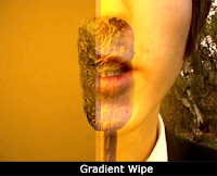 I used a gradient wipe, this made the start of my video eye catching and to make the changeover from one clip to the next more interesting – it also showed a changed of location. I used various types of dissolves; I used a ripple dissolve in places; firstly, to change the colour of a shot effectively and in an overlapping image where the water dissolved away showing just the artist, this linked with the lyrics and pace of the video. Another dissolve was the cross dissolve this was used frequently to blend clips together which would of maybe jumped or wasn’t lined up correctly, this transition hid any continuity at the capturing stage.
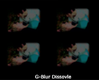
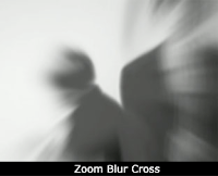
I also used a G blur dissolve, this is what I used to mask the mobile phone footage, it made it appear more interesting and by layering up and the repetition disguised it well that the clip was of not so good quality. I also used a zoom blur cross transition, because I didn’t record the correct thing I storyboarded, I used the transition to hide that the singer wasn’t singing because I didn’t want to waste the clip and I wanted to use more of the trumpet.
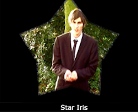 Other transitions were the iris group, I used a star iris –
 this related to the lyrics and the footage with the “stars flying high” lyric, it worked well because it followed the phone footage bring the attention to the next shot and distracting any bad quality.
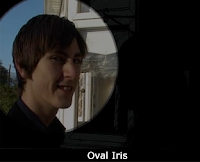
I also used an oval iris, I think this worked well at the end of my video because it mimicked an ending of a romantic, feel good short film. It highlighted the main character in the narrative and concluded the story, I spent a lot of time manipulating the settings and using a freeze frame to transit with but I feel it was worth it as it keeps a professional feel of the video right to the end.
I also used several types of filters, the main media technology was the colour corrector and colour corrector 3 – I used this on every single shot; I used it to enhance the colours making the outside shots more summery by highlighting the greens. I used it to colourise the image with bright colours I felt this was effective because it added to the pop genre and to the pace of the video. I also used it to make the artist appear flawless which I found is a typical convention. To give a variety of colours I used tints, I used this effectively in the restaurant scene to give the lighting more of a romantic mood by using a crimson red.
To give the video depth and an artistic feel I used a desaturate filter which removed the colour and made it black and white, in the performance section the colour corrector worked effectively with this filter to posterise and make the artist bolder. In the bedroom scenes it was a subtle contrast to the colour images in the following shots. 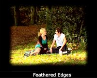

Within the instrumental scenes’ I manipulated the edge control, I made it look like a moving picture frame, to show and highlight the memories of his dates with his love interest, I also feathered the edges to make them dreamy looking.
I also uploaded the mp3 track to use as the music for the video, this was the basis of the video and allowed me to sync the clips together.
I also uploaded the mp3 track to use as the music for the video, this was the basis of the video and allowed me to sync the clips together.
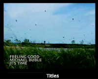 Another media technology was incorporating titles; I used text to introduce the song and the artist which is a typical convention. I also used Live Type 2, this programme allowed me to create the handwritten effect at the end; this worked effectively as it concluded the love story and made the end more appealing.
 To construct the print artefacts, I used a digital camera which used a memory card this was effective because it gave better quality images for the album cover and poster which I wouldn’t have got by freeze framing from the video. After uploading the series of images through the USB cable I was able to choose and begin the construction stage.
I used Adobe Photoshop to create the album cover and poster. I imported the images I had previously taken and used the polygonal lasso tool to go around the image and cut out the background this was effective because I could then place my image on any background I create. I manipulated the settings in the brightness/contrast and the curves this made the image look more professional and eye-catching to go on the cover. I then searched Photoshop tutorials to give me an idea in how to form my cover, I found http://www.adobetutorialz.com/articles/3073/1/Glamour-model however I changed and altered things to make it adapt to my own ideas, for example instead of using the swirl pattern I incorporated the clock image to go with the title of the album “It’s Time” I added it as a brush and was able to use it. I added text and used the blending option tool to change the settings. I feel this tutorial worked effectively to create an abstract but effective album art. To create the poster, I found a previously made one by HMV on Google and copied the layout. I used the desaturate to remove the colour and then applied an adjustment curve to the layer, after I duplicated the image I used the Gaussian blur effect and then used the eraser tool to give the image a focus point (the artist’s face). I copied and pasted the HMV dog logo and used the same colour and font to recreate the necessary text. Lastly, I copied and pasted the album cover to complete the poster.
I used Adobe Photoshop to create the album cover and poster. I imported the images I had previously taken and used the polygonal lasso tool to go around the image and cut out the background this was effective because I could then place my image on any background I create. I manipulated the settings in the brightness/contrast and the curves this made the image look more professional and eye-catching to go on the cover. I then searched Photoshop tutorials to give me an idea in how to form my cover, I found http://www.adobetutorialz.com/articles/3073/1/Glamour-model however I changed and altered things to make it adapt to my own ideas, for example instead of using the swirl pattern I incorporated the clock image to go with the title of the album “It’s Time” I added it as a brush and was able to use it. I added text and used the blending option tool to change the settings. I feel this tutorial worked effectively to create an abstract but effective album art. To create the poster, I found a previously made one by HMV on Google and copied the layout. I used the desaturate to remove the colour and then applied an adjustment curve to the layer, after I duplicated the image I used the Gaussian blur effect and then used the eraser tool to give the image a focus point (the artist’s face). I copied and pasted the HMV dog logo and used the same colour and font to recreate the necessary text. Lastly, I copied and pasted the album cover to complete the poster.
To conclude my coursework, I created the evaluation; firstly I drafted my answers on to Microsoft Word, this technology allowed me to check spelling and punctuation. I then copied it as a new post on my blog page. Too illustrate my answers, I embedded images taken from the timeline to support my points.
All these are technologies that I have used for my coursework, and have learnt about them and used them effectively to create the sections to my project.


